When a Rebrand Misses the Mark
Rebrands are meant to refresh a company’s image and spark new growth, but history shows that even the most well-funded campaigns can go spectacularly wrong. The following five branding missteps are a reminder that the most important voice in the room belongs to the customer.
Logos, packaging, and messaging are not just marketing tools. They become emotional anchors that connect a brand to its audience. Consumers recognize a piece of their own routine, their history, and their identity in those designs. When companies disrupt that bond without a compelling reason, they risk losing the trust of the very people who built their success. The Cracker Barrel rebrand controversy is proof that this is not a relic of branding history. It is a modern lesson in how quickly even iconic brands can misread their audience and pay the price.
The Cracker Barrel Saga

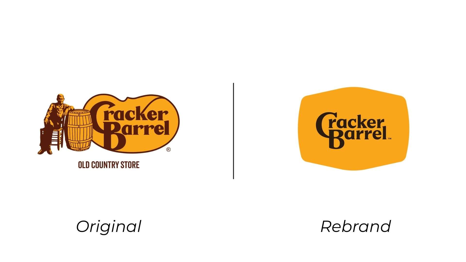
In August 2025, Cracker Barrel attempted a bold refresh to attract younger diners. The redesign simplified the company’s logo, removing the iconic figure affectionately known as “Uncle Herschel.” According to Cracker Barrel’s leadership, the goal was to modernize the brand and appeal to a new generation of customers.
Instead of applause, the move sparked outrage. Conservative commentators, including Donald Trump, criticized the change publicly. Social media campaigns trended against the company, and within days the backlash translated to a $100 million drop in stock value. The board quickly reversed course, restoring the classic branding.
The rebrand was developed internally, with input from outside consultants, but the campaign’s failure shows that brand equity is not a design trend to be discarded. Cracker Barrel underestimated how strongly customers connected with its nostalgic imagery, and it paid a steep price.
Gap’s 2010 Moments of Regret

Gap’s 2010 rebrand was meant to modernize a decades-old logo. The company worked with Laird & Partners to create a clean sans serif wordmark with a small gradient box, positioning the brand as more fashion-forward.
The reaction was immediate and severe. Social media campaigns mocked the logo, customers threatened boycotts, and the design community criticized the loss of heritage. Within six days, Gap reversed the rebrand, but the damage was already done. Industry analysts estimate the incident cost around $100 million in lost marketing spend and public goodwill.
Gap’s error was failing to communicate a reason for the shift. Rather than refreshing its identity with purpose, the change felt arbitrary. Consumers had no reason to embrace a logo that erased their connection to a brand they had worn for decades.
Tropicana: When Minimalism Becomes Invisible

In 2009, Tropicana hired the Arnell Group to overhaul its packaging. The classic orange with a straw was replaced with a sleek design featuring a glass of juice and a plain logo. The goal was to make the brand feel “contemporary” and “fresh,” according to Arnell’s pitch.
Consumers revolted. Shoppers could no longer identify their favorite juice on crowded grocery shelves. Within two months, sales plummeted by roughly 20 percent, representing tens of millions in losses. Tropicana quickly reinstated the original packaging.
The mistake highlights the danger of ignoring shopper habits. Packaging is more than aesthetics; it is a cue for trust and familiarity. The sleek look alienated buyers, showing how minimalism can become a liability when it erases identity.
Radio Shack’s Shrink to “The Shack”

In 2009, Radio Shack partnered with brand consultants to reinvent itself as “The Shack.” Executives believed the new name would make the company sound modern and appealing to younger consumers.
The rebrand confused loyal customers who associated Radio Shack with technical expertise and a love of electronics. The effort did not resonate with new audiences, and sales continued to decline. By 2015, Radio Shack filed for bankruptcy, and “The Shack” campaign was remembered as a costly distraction rather than a turnaround strategy.
The lesson here is that branding cannot save a failing business model. A new name without substance is not innovation, and removing the brand’s technical identity alienated its base rather than energizing it.
Kraft’s Modern Misfire

Kraft attempted a sweeping rebrand in 2009, swapping its bold, familiar logo for a softer, modernized look. The new identity, created by a European branding agency, featured a swoosh and brighter colors. Executives said it was meant to reflect Kraft’s global presence and commitment to health-conscious products.
The public saw it differently. Critics compared the design to that of a yogurt company, and customers found it uninspiring. Within months, Kraft returned to a more traditional logo, quietly abandoning the expensive rebrand.
The failure illustrates the danger of generic design. Kraft’s brand equity was built on nostalgia and trust. In trying to appear “global” and “fresh,” it lost its identity entirely.
The Lesson Behind These Mistakes
Looking back, many of these branding flops were not random accidents but reactions to major cultural and economic pressures. The late-2000s recession is a key backdrop. Legacy brands like Tropicana, Gap, Kraft, and RadioShack were all fighting to remain relevant in a market where consumer confidence had plummeted, younger shoppers were harder to impress, and competitors were experimenting with sleek digital-age aesthetics. In that climate, executives often traded thoughtful evolution for dramatic reinvention, hoping a bold new logo or package design would spark growth.
The data shows that strategy rarely works. Gap’s $100 million loss came from a six-day campaign. Tropicana lost 20 percent of its sales in two months. Cracker Barrel’s recent stock plunge proves these mistakes are not relics of the past; they are cautionary tales still unfolding. These decisions often happen in boardrooms, where leadership is pressured to deliver results fast, but the voice of the consumer is undervalued.
Branding is not just visual identity. It is a shorthand for trust, nostalgia, and belonging. A favorite sweatshirt, a carton of orange juice, or a restaurant logo becomes part of a customer’s memories. Disrupting that relationship for the sake of appearing “modern” or “innovative” can feel like betrayal. While some rebrands eventually recover through consistency and clear messaging, others remain cautionary tales.
Economic downturns and cultural shifts tempt companies to gamble with their identities, but the most successful brands understand that reinvention is not about erasing the past. It is about building on it. When a brand chooses evolution over monumental short-sighted changes, it sends a message of stability in uncertain times, which is exactly what customers are looking for. Rebrands that fail, ignore this truth, while those that succeed, prove that listening to consumers is not only good marketing, it is good business.